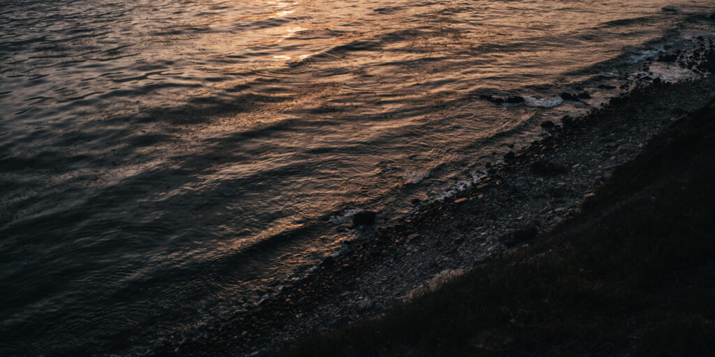
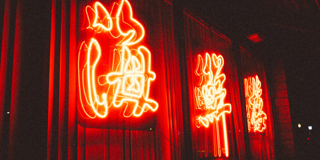
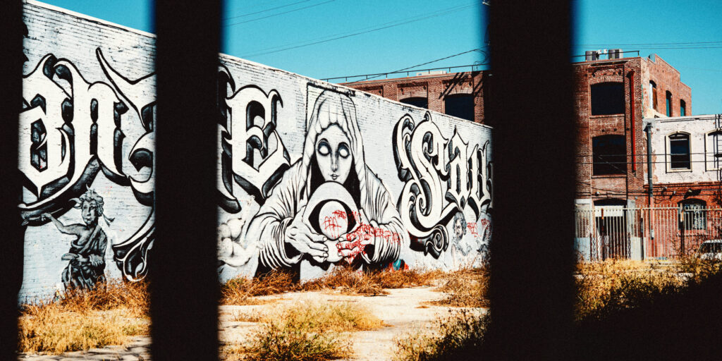
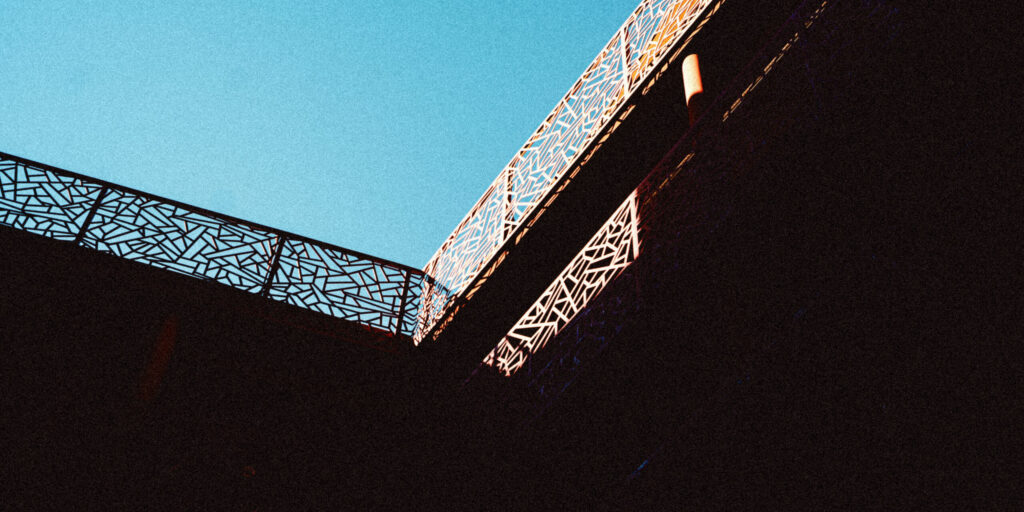
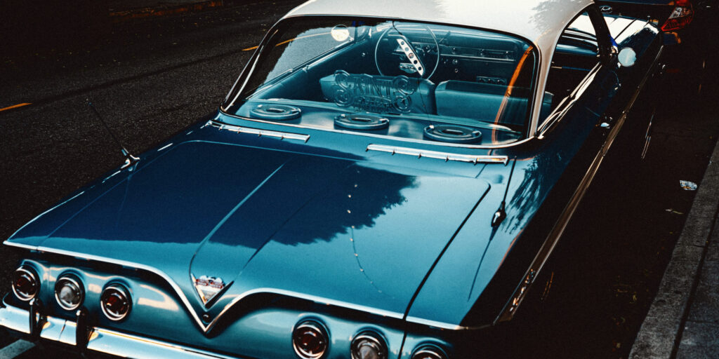
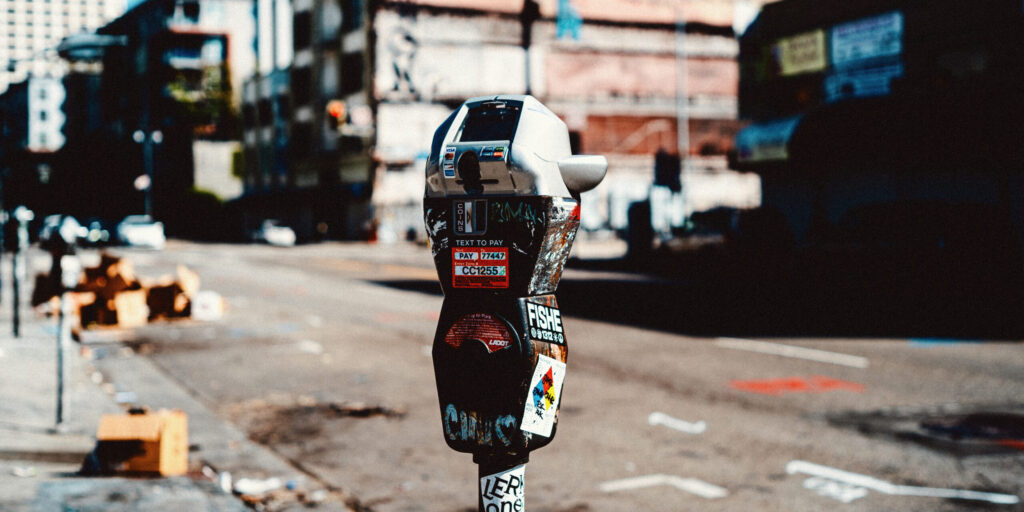
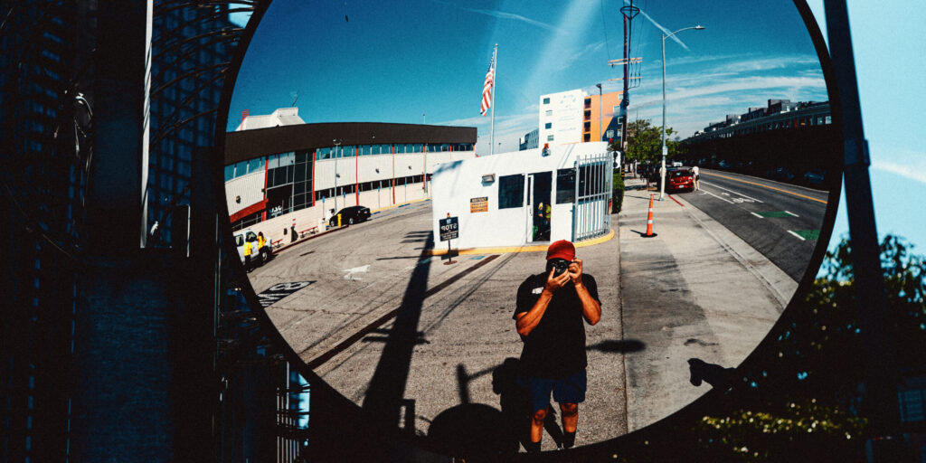
After attending a friend’s photography show at Icon gallery at the end of 2024, I was inspired to switch up my framing to a wide 16:9 aspect ratio. I personally love the Micro43 but I do have a collection of full frame gear for professional purposes. I just never cared to use full frame when I’m out and about on walks around the neighborhood. But I had a Panasonic S5 that I had mixed feelings about (still do), and was collecting dust, so I bought a Minolta MD to L-Mount adapter and put my favorite Minolta Rokkor lenses to work.
I went about my photography with the intent to spend a year shooting manual focus only with S5. It took some used to and I realized that I could not get the same type of images that I was accustomed to. It really came down to the handling. The S5 paired with a full metal Minolta lens came with added weight and having to use both hands compared to something like my Olympus E-M5ii or Panasonic GX7 and GX8.
Having to take the time to compose a picture vs capturing one added a lot to my perspective but it also detracted from the experience that I came to enjoy from one-handed shooting. I can’t actually say that I liked the experience, and it created a division in my approach; one for art and one for therapy.
I was happy to end the experience after a year, and went back to using my favorite Micro43 cameras and lenses, but then I went and bought an M-Mount lens for the S5, and that changed everything again. I’ll save my thoughts on that for another post, but for now, here are a few of my favorite wide-angles images.
Ever wonder what keeps a brand moving forward, day in and day out?
Labels. Duo bands. Aisle interrupters. Mirror clings. Product brochures. Endcap displays. Caddies. Planograms. Holiday promos. Meetings. Product renders. Sell sheets. Calendars. Floor displays. Coupons. Header cards. Store shelf strips. Proof sign-offs. Fact sheets. Hangtags. Ingredient revisions. Ads. Product codes. Point-of-purchase displays. Eight-language product directions. File production. Did I miss any?
These are the regular, frequent tasks of a graphic designer. Not the kind of stuff I’d submit to Communication Arts or even show in my portfolio. But they’re what keeps a brand visible, consistent, and on point.
Where I learned this
I stepped into the design world when analog tools were fading and digital design was still Quark XPress~ly slow. In 2000, I landed my first design job working under a legendary brand designer. He didn’t know how to use a Mac, but he sure knew how to curse anyone waiting for the screen to turn on.
I commuted three hours each way from Pomona to Brentwood just to keep that opportunity. The work was intense and the environment was Mad Men-level chaotic. It was also where I learned to fight for my ideas and to design for real-world production, not just for my portfolio.
The other side of the story
Today we see polished, Insta-perfect brand decks all over the internet. That’s one side of the story. I’m grateful to have a portfolio full of that kind of work, and honestly would love more of it, but most of my career has been built on the bread-and-butter jobs. Brands aren’t out there refreshing every season. So it’s labels, ingredient changes, press checks, hangtags, sell sheets, and duo caddies that support the marketing efforts.
Here’s what I’ve noticed. Launches and rebrands get the attention, but the steady work is what earns trust. When a client knows every proof will be clean, every file will be production-ready, and every change will be handled right the first time, you stop being a vendor and become part of the team. That’s how one-off projects turn into lasting client relationships.
This work may not be glamorous, but it’s essential. It’s kept me in business for over two decades.
If you’ve ever felt “less than” for not posting cool mockups every week, let me tell you: those are just mockups.
The everyday work is the work. And it matters. All of it.
Like our parents, I had kinda gotten to the place where I refused to learn how to use a VCR.
Over the years I have had to let go of many things such as job titles, relationships, friendships, where I lived, and many others but I have never let go of my definition of graphic design. Here’s why that’s no longer working for me.
I graduated high school in 1994 and received my Bachelor’s degree in 2000. I began my design career at the time when Adobe Photoshop and Illustrator were in their early single digit versions, QuarkXPress was the king of layout and our lab computers were beige and referred to as “PowerMacs”. I stored my designs on ZIP drives and always encountered issues at Kinko’s when trying to output a Fiery print (remember those?). I don’t think any of us young designers at that time knew how we were supposed to collect fonts and image links. And it wasn’t like Kinko’s cared to explain, or refund us for the time we were charged.
Fast forward to today and everything has changed, from computing and imaging technology to my personal life. I can’t grow my hair out like I used to, I sport a beard now, I lost both of my parents, I gained a beautiful wife and two spunky daughters, and I even became a Zumba instructor. Whew!
I allowed space for new activities and new clothes to feel new but oddly I kept graphic design old school and rooted in the past. The designers that I admire were born in the ’30s and ’40s. Their print work produced in the ’60s and ’70s became my cornerstones. I produced tactile product packaging, designed brochures with premium paper stocks, embellishments, and multi-folds, and I regularly mocked up boxes with complicated scores and folds to make sure the art panels were oriented in the right fashion. I did what I thought was a continuation of the legacy of design, firmly rooted in something you could hold. And that worked until our experiences became framed through a 9:16 ratio screen.
Everyone’s attention moved to the digital world, and like many older designers, I found myself not adapting quickly enough. And since promoting my work on social wasn’t a skill I’d cultivated in two decades, I started going backwards to a place of comfort.
Where my work used to speak for me, video editing for TikTok and Instagram Reels became the skill I was told I needed to succeed. Show my work, explain my process, demonstrate client metrics, be cringy, but don’t be afraid to be cringy. Graphic design is out. AI can do that. I have to be a Brand Designer. AI can do that. I have life experience, so I have to be a Brand Strategist. Hold on, Claude can now…
I don’t need a single label, or to keep trying to figure it out. The world keeps telling me my title is outdated, but I know that my skills aren’t.
I am a designer, photographer, brand strategist, and an all-around creative person. And I know how to use the VCR.
I used to sell logos. Now I want to teach the thinking behind them.
For a while, I was selling the logo as a key part of my design process. To justify my pricing and structure, I also included branding and brand guidelines, and the price depended on how deep the client wanted to go.
But I never wanted to just redesign someone’s logo and leave it at that. That only focuses on the visual side. It never answers why the logo needed to be refreshed, what it stands for, or whether it’s still relevant to the business.
The guideline that nobody sees
So I’d design a logo and a system for the client, with a brand guideline as an attachment. The guideline wasn’t an afterthought, but it wasn’t my selling point either. On social media, you don’t really get the chance to showcase a brand guideline. It doesn’t look as good as the logo, or the mockups on vehicles and storefronts. And as designers, we love that finished piece. We want to say, “Hey, look what I did.”
But underneath that is the brand, and branding is the real work we do as designers, at least as we mature in the field.
The dry cleaner problem
Nowadays, when I look at a logo, it’s trippy. If I focus only on the logo, it’s just a sellable item, no different from a hamburger or taking your clothes to the dry cleaners. You get your service, you get your product back, and that’s it. It doesn’t open up any opportunity for the client to do something with the process they went through.
Design that lives with the client
True design lives with the client for life. They buy it from you, but it also educates them. They can take the processes you introduced, and even the logo itself, and keep reinventing and refreshing their own work. Not just their business needs from a design standpoint, but through life. You start to question the why of everything. Why does this need to be done? Do I really need this? Is this actually helpful? That doesn’t just apply to the business anymore. It applies to every part of life, and that’s when design really takes off, because it becomes a life tool.
What I was leaving out
I got burned out on focusing only on the symbol. I wanted to show it on social media without giving my audience or potential clients any idea of how we got there. What were the steps? At the end of the day, the symbol itself isn’t as important as the education the client and I went through together: learning their story and where they really want the business to go.
So now I want to move into a new realm, and it’s been hard, because old habits die hard. I came up looking through design books and the finished pieces of the great designers from the 50s and 60s. I didn’t question how they got there or what they did, except for a few designers who worked on big brands, where I knew there were steps behind the result. With pure graphic design, I just liked the way it looked.
Why education
But I’m older now, and we’re in a new era where everything has to be reassessed, reinvented, and reinvigorated every couple of years. So I think it’s a natural evolution to move into education. It’s something I can keep growing in myself, and my clients are hiring me, or want to, so they can learn the mindset behind story, positioning, and the other pieces that make up branding. Not only for business, but for the choices they make in everything.
If you want to understand the why behind your brand before you refresh the logo, let’s talk.
Those 1960 and 1970 graphic designers and typographers really set the bar high!
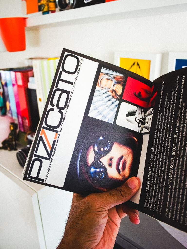
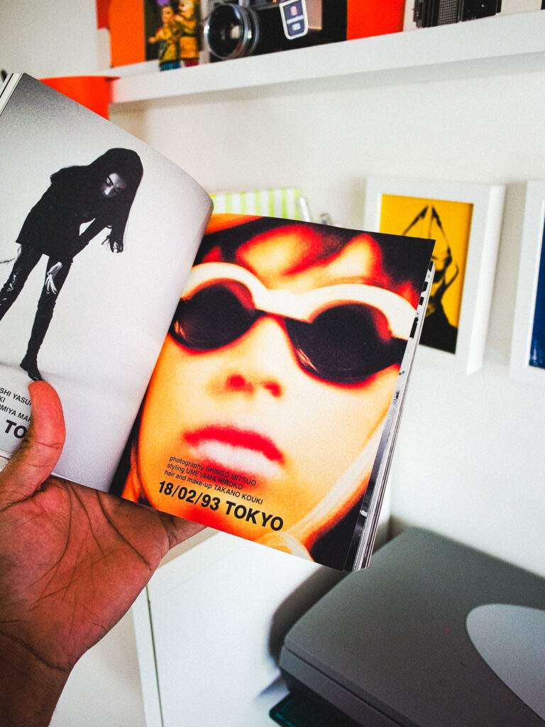
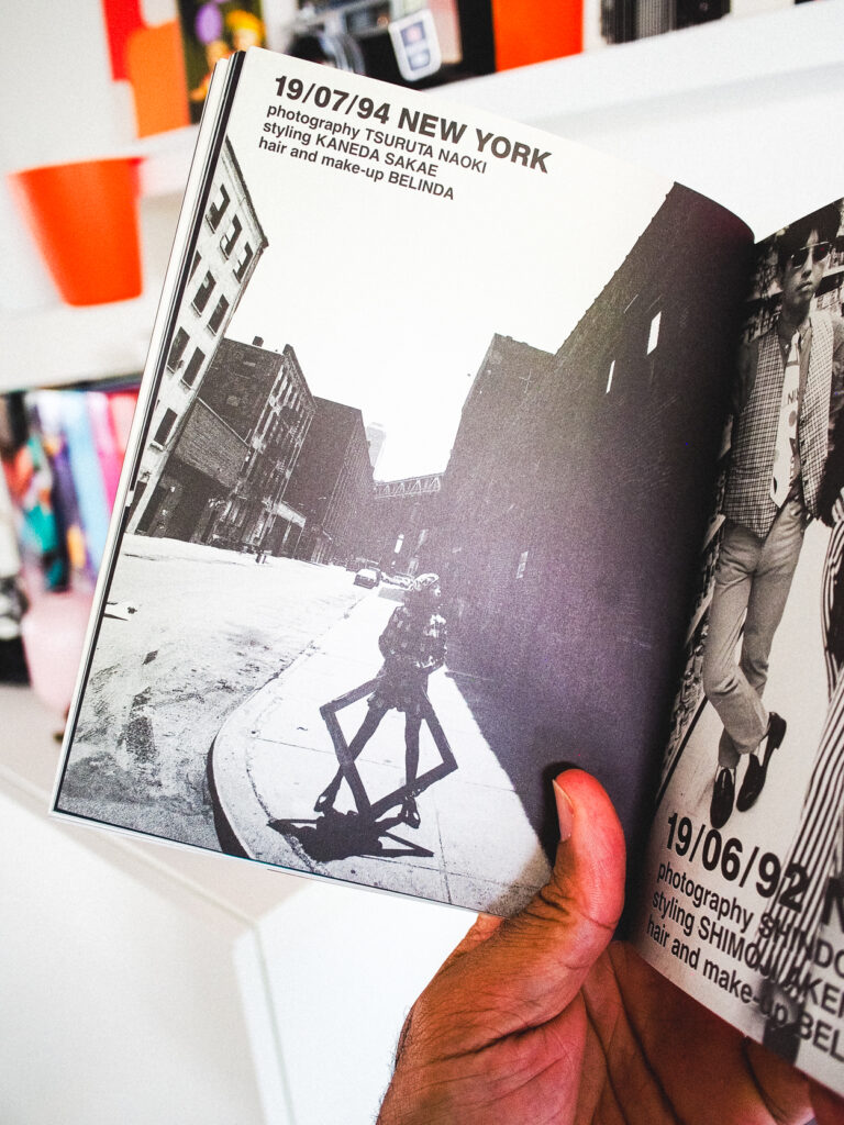
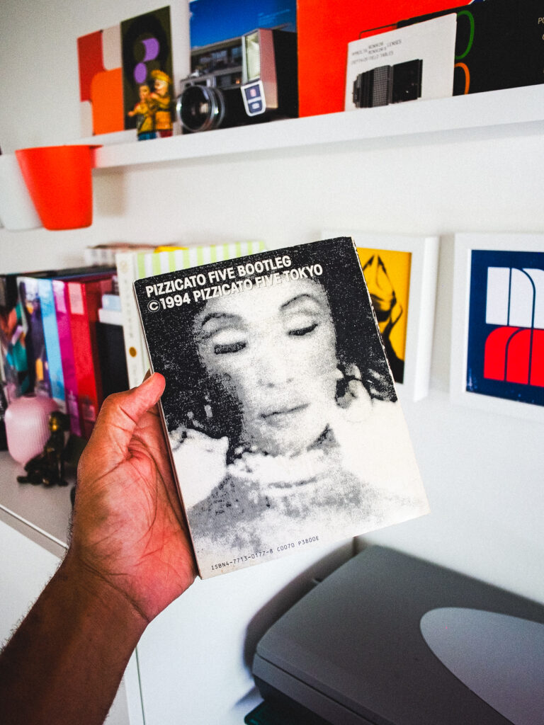
Take this album cover for example. Look at how bold that logo is and how “super” the colors look. There was no Adobe Illustrator to make this magic happen. And then look at how well this translates into Japanese. With nothing but their hands and probably a protractor these pioneers defined an era without programs that we rely on today.
I’m not sure if I would have had the skills to do what they did. Thank goodness I have photography. I know I would have been an album photographer instead.
Big afro, black turtleneck, curdoroy pants, and high-kicks to any jive sucka who got in the way of my shot!
I was at Tower Records in 1997 when I found Pizzicato Five’s “Happy End of the World” on the listening display console. Remember those? You could slide the headphones on and check out track after track from new and upcoming music artist.
I was in my Mod Squad phase at that time, and Pizzicato Five’s retro pop appeal sat nicely alongside the sounds of Beck, Oasis, and Mike Flower Pops. Their music very catchy but they really hooked me in from their design aesthetic, photographic boldness and stand-out typography.
Also at that time, despite having lot’s of Japanese friends, getting my hands on Japanese music was still rare and expensive. So when Pizzicato Five produced an American release, I was over the moon happy to be able to afford it.
I still have their CD. And to this day I still listen to them.
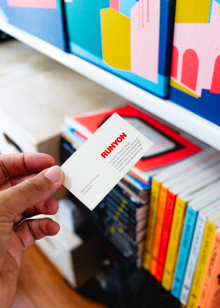
This was the first design firm that I worked at out of college.
After graduating from Cal State Fullerton I was offered a designer position with Richard C. Runyon Design. Early in his career he worked under the legendary Saul Bass. Forming his own agency in the 70’s he went on to create the original Federal Express, Betty Crocker, Spruce Goose and Hansen logos. By the time I joined the firm in 2000 we were designing ads for China Southern Airlines along with corporate brochures for early startup companies.
Working with Richard was an old school, MadMen experience. The office was filled with cuss words and fights! I would psyche myself up for fifteen minutes before heading into the office to be greeted by a slurry of insults. At one point I called my mom and told her this man has called me every bad name except the n-word.
I stayed and persevered for almost two years. Partly because I didn’t know any better and partly because I had the experience to jump headfirst into some amazing projects. I developed a thick skin and bold attitude about graphic design and my place in the field. He pushed and I shoved back with even better designs.
When I present work I criticize myself first before the client has a chance. It can be the difference between being asked for revisions or being told that they are going in a new direction…without you. That’s what Richard taught me. I searched for him for several years before discovering that shortly after I left his firm that he passed away in a plane crash.
Despite all of the craziness during my time under him I hold those years in very high regard. I’ve held unto this business card for 25 years now. 25 years I’ve been a professional graphic designer.
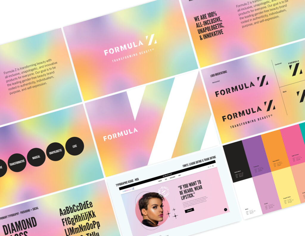
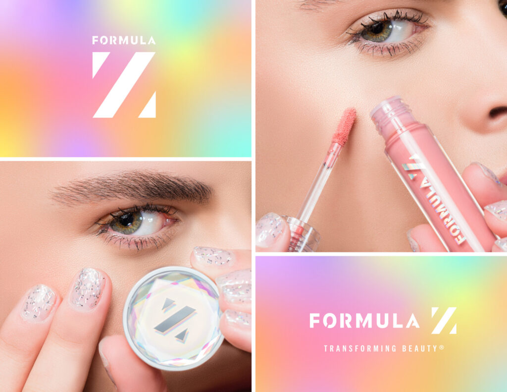
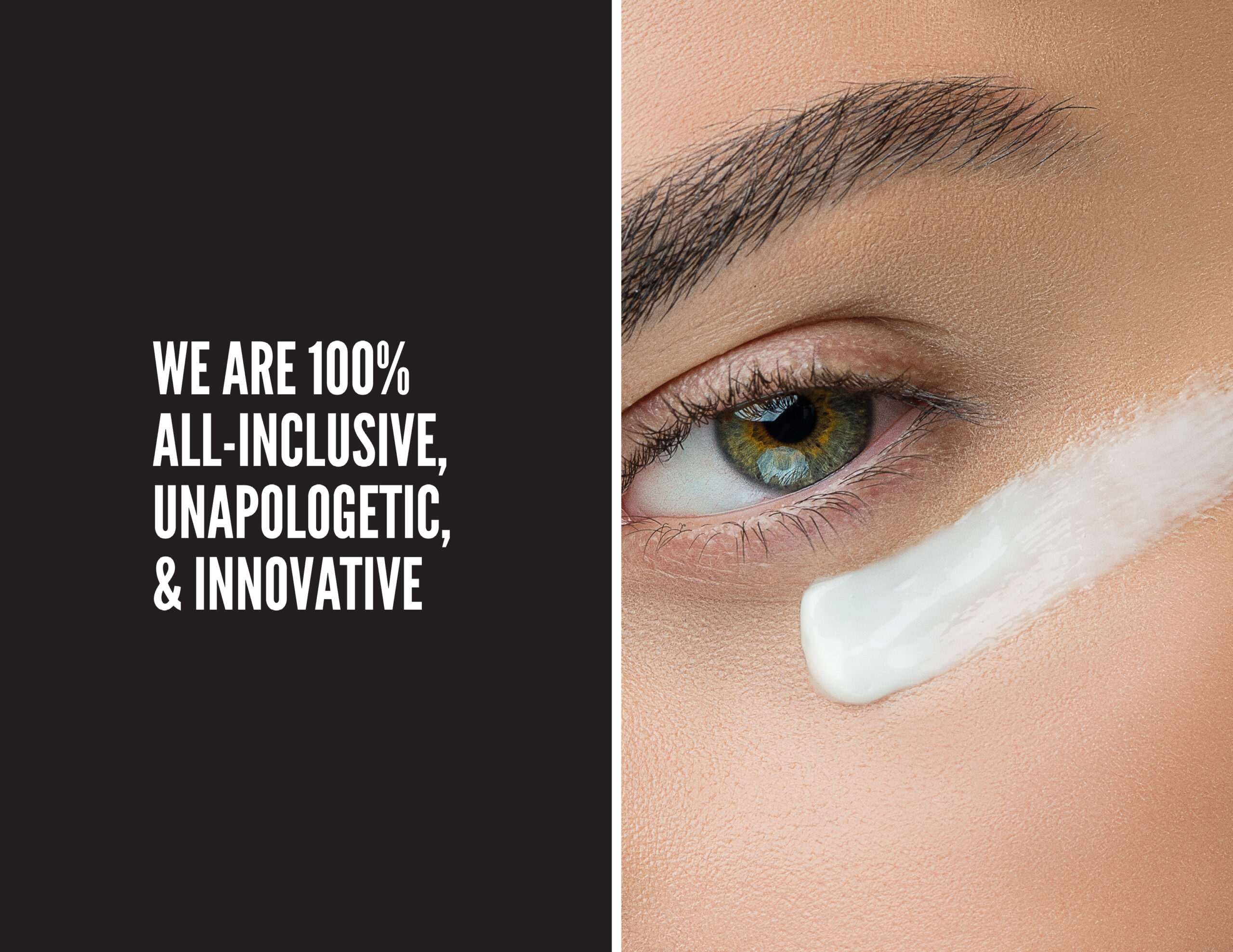
Formula Z was founded by teen makeup artist and entrepreneur Zach Dishinger. The brand aims to lead the gender-free beauty space with authenticity, individualism, and self-expression.
To help them achieve this, I partnered with Formula Z to refresh their visual and verbal identity. We carefully analyzed their brand assets and crafted a stronger, more unified look. At the same time, we ensured the brand remains adaptable for future growth.
At its core, Formula Z believes that makeup is a form of self-expression for everyone. Feeling beautiful is a human experience—one that transcends gender, skin color, or who you love.
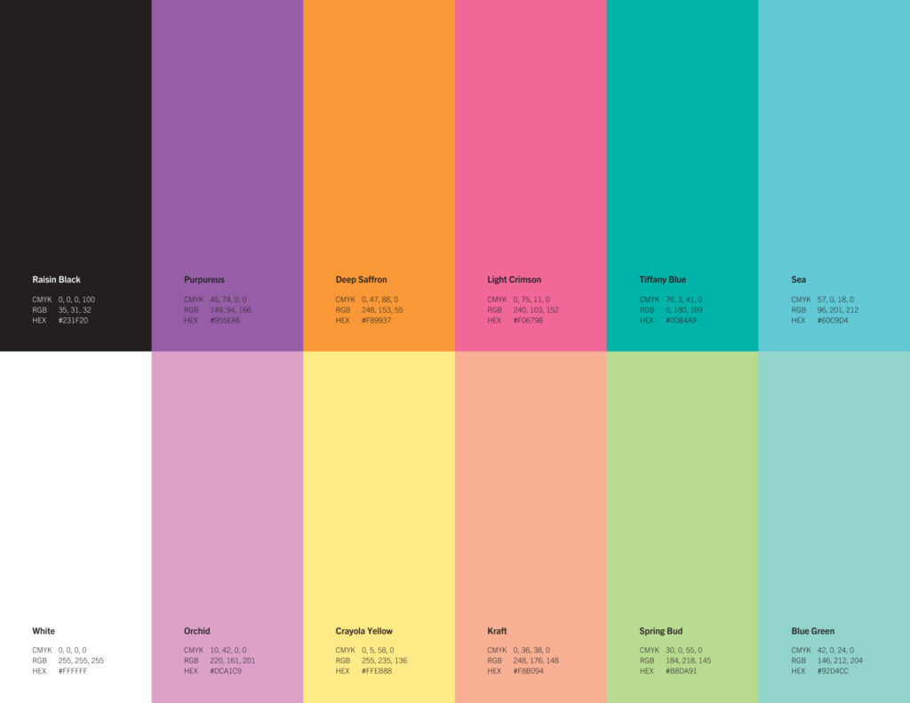
Through our collaboration, we defined their mission, positioning, and tone. We also established clear guidelines for typography and headlines. All of this was distilled into a comprehensive 24-page brand guide.
What I did : Graphic Design, Verbal Identity, Branding
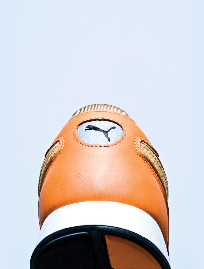
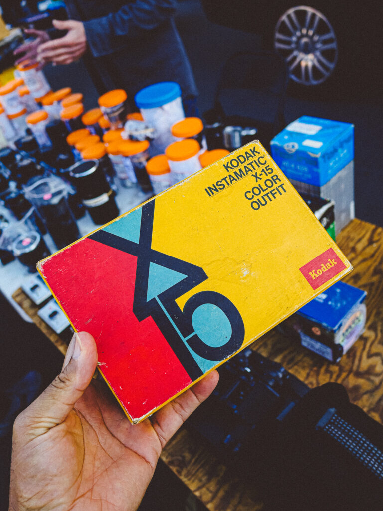
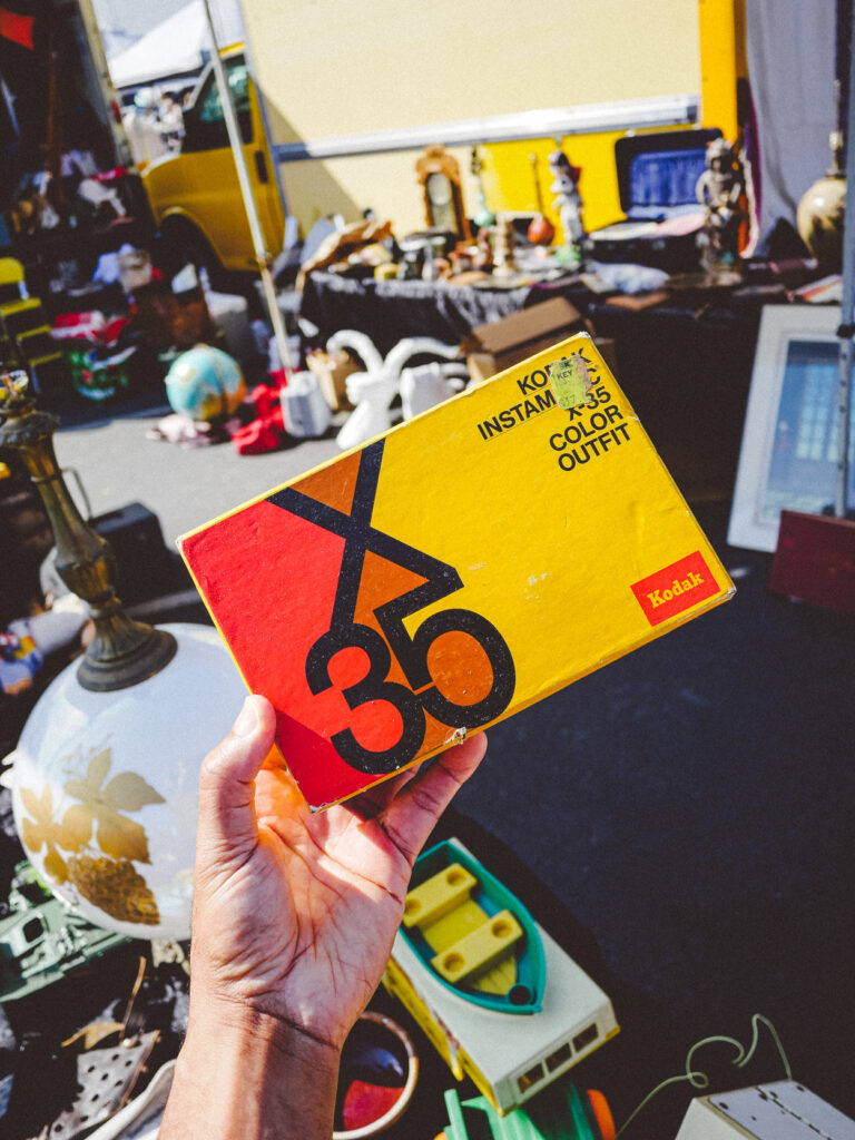
Hmm, I picked my personal brand colors way back. Looking at my past work, I see clearly my preferences for yellows and oranges as they made their way into my portfolio work. The takeaway…we are subconciously guided by patterns, whether behaviorial or vectorial.
The simplest design is oftentimes the best. Although they stumbled as a business, Kodak definitely succeeded as a brand. The easily recognizable colors and logo conjure up warm feelings of nostalgia across the world. Think of Canon and Nikon and you might think “professional”. Now think of Kodak. I imagine “fun, film, photo labs, joy, sharing, anticipation, excitement”.
Despite essentially withdrawing from the camera market, there are enough advocates for Kodak to continually shape its perception as a brand. And that right there is the power of branding.